The Basics of Calligraphy Composition: Layout and Design
Understanding the Importance of Layout in Calligraphy
Layout is the backbone of any calligraphy piece; it dictates how your words are presented on the page. A strong layout can enhance the overall aesthetic appeal, making your work not only readable but also visually captivating. Think of layout as the framework of a house; without it, your beautiful calligraphy might not stand out as it should.
Design is not just what it looks like and feels like. Design is how it works.
When considering layout, think about the balance between text and negative space. Too much text can overwhelm the viewer, while too much empty space can leave your piece feeling incomplete. Striking the right balance ensures that your calligraphy is both engaging and harmonious.
Ultimately, a well-thought-out layout can guide the viewer's eye, creating a natural flow that leads them through your work. This flow is essential, especially if your calligraphy is part of an invitation or a quote that you want people to enjoy and absorb.
Choosing the Right Format for Your Calligraphy
The format of your calligraphy piece can significantly influence its impact. Whether you're working on a card, a poster, or a personal project, each format has its own set of considerations. For example, a tall, narrow card may lend itself to vertical lettering, while a wider canvas invites more expansive designs.
Consider the message you want to convey with your calligraphy. A formal event might require a more traditional layout, while a casual invitation could benefit from a playful, modern approach. This decision will guide not only your layout but also your choice of fonts and styles.
Importance of Layout in Calligraphy
A well-thought-out layout enhances the visual appeal and readability of your calligraphy.
Remember, the format should complement the content of your work. It’s like dressing for an occasion; you wouldn’t wear a tuxedo to a beach party. Choose a format that enhances your message and reflects the mood you’re aiming to create.
The Role of Negative Space in Calligraphy Design
Negative space, or the empty areas around and between your letters, is a crucial element in calligraphy composition. It might seem counterintuitive, but these empty spaces can be just as important as the words themselves. They help to create a breathing room that allows the viewer's eye to rest and appreciate the design.
The details are not the details. They make the design.
Using negative space effectively can also enhance the readability of your text. If your letters are too close together, it can lead to a cluttered appearance that’s difficult to read. By allowing for adequate spacing, your calligraphy can shine while remaining accessible to the reader.
Think of negative space as the silent partner in your artwork. Just as silence can emphasize a powerful moment in music, negative space can highlight your calligraphy, drawing attention to the beauty of your letters.
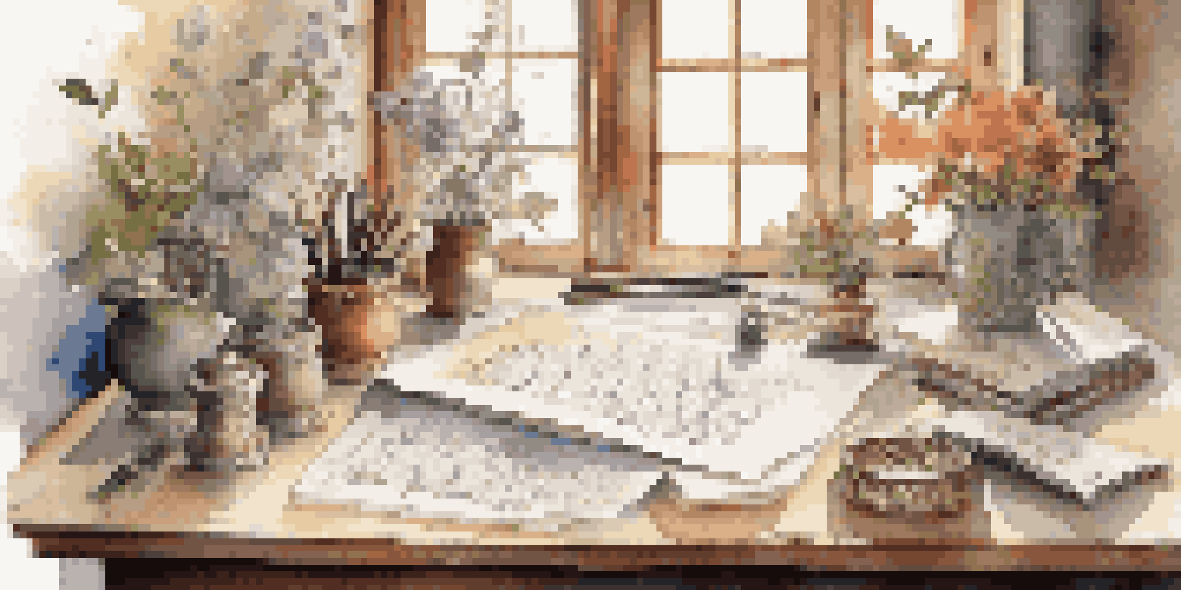
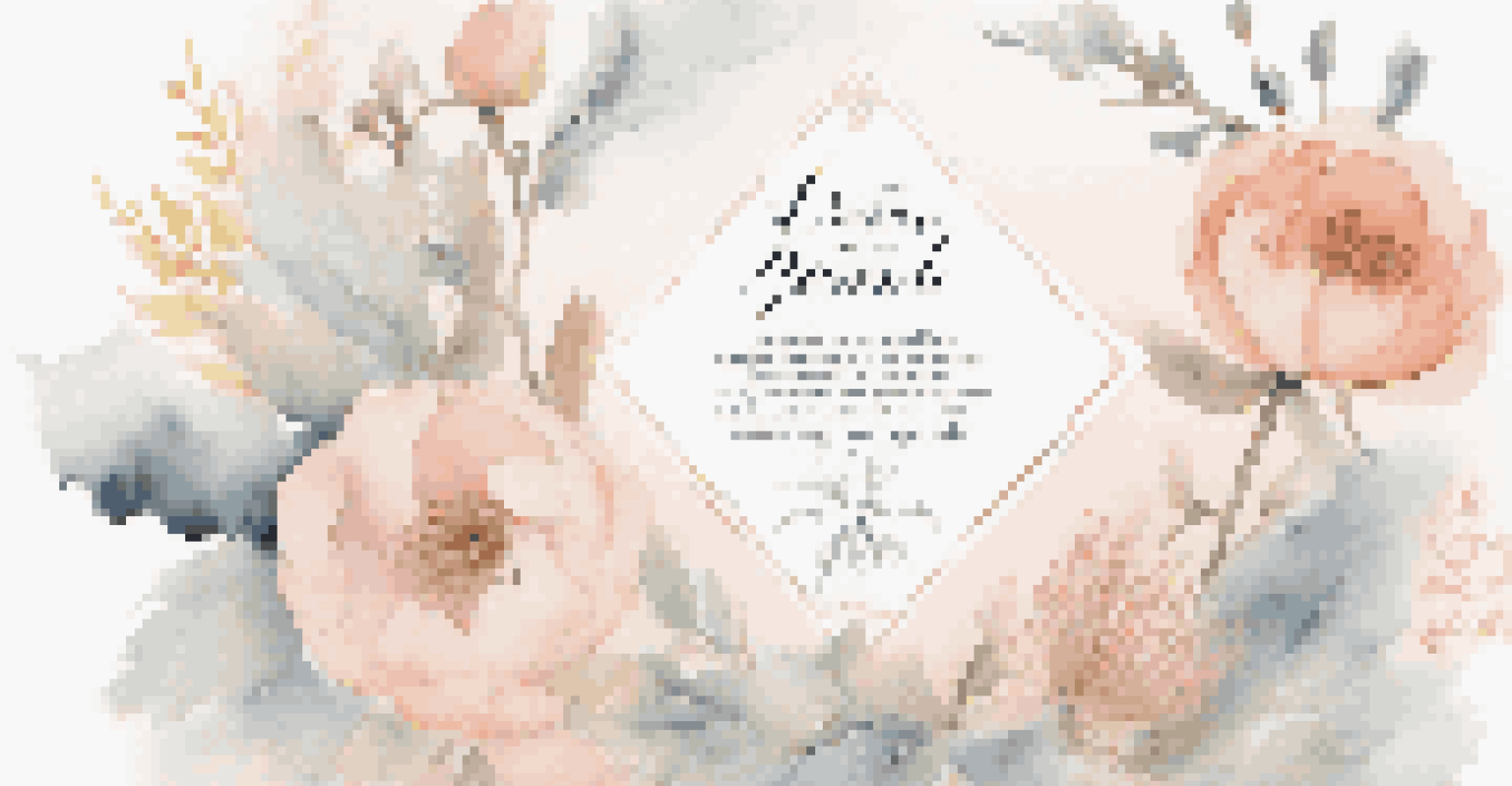
Incorporating Visual Elements into Calligraphy Layouts
Adding visual elements, such as illustrations or decorative borders, can elevate your calligraphy to new heights. These elements should complement your text rather than overshadow it, creating a cohesive look that draws the viewer in. For instance, floral designs can beautifully frame a quote without distracting from the words themselves.
Consider the overall theme of your piece when selecting visual elements. A rustic theme might call for botanical illustrations, while a modern piece could incorporate geometric shapes. Aligning these elements with your calligraphy style helps to create a unified design.
The Role of Negative Space
Effective use of negative space allows for better readability and emphasizes the beauty of your letters.
However, it’s essential to strike a balance. Too many visuals can clutter your layout and detract from the calligraphy. Aim for simplicity and elegance, allowing your words to be the focal point while the visuals enhance the overall composition.
Choosing Fonts That Complement Your Calligraphy Style
Selecting the right font is pivotal in achieving a harmonious calligraphy composition. If you’re using a combination of hand-lettered text and digital fonts, ensure they complement each other. For example, pairing a flowing script with a clean sans-serif can create a beautiful contrast that still feels cohesive.
Consider the mood of your calligraphy when choosing fonts. A whimsical quote may benefit from a playful font, while a formal invitation calls for something more traditional. This alignment between font choice and message is key to effective communication.
Don’t be afraid to experiment with different fonts, but keep readability in mind. If viewers can’t easily read your text, the beauty of your calligraphy is lost. Aim for a balance between creativity and clarity to ensure your message shines through.
Creating a Focal Point in Your Calligraphy Design
Every great piece of calligraphy should have a focal point that draws the viewer's attention. This could be a particularly elegant letter, a striking word, or even a decorative flourish. Establishing a clear focal point helps to guide the viewer’s eye and emphasizes the most important part of your message.
You can create a focal point through size, color, or placement on the page. For instance, making one word larger than the rest can highlight its importance, while using a contrasting color can make it pop. Think of it as the spotlight on a stage, drawing attention to the star of the show.
Creating a Focal Point
Establishing a clear focal point guides the viewer's attention and highlights the most important aspects of your message.
However, be cautious not to overwhelm the viewer with too many focal points. A cluttered design can confuse the eye and dilute your message. Aim for one primary focal point that stands out, while supporting elements gently guide the viewer’s attention.
Finalizing Your Calligraphy Composition: Review and Revise
Once you’ve crafted your calligraphy composition, it’s time to step back and review your work. This stage is crucial; fresh eyes can help you spot imbalances or areas that need improvement. Take a moment to assess the overall layout, ensuring everything feels cohesive and intentional.
Ask yourself questions like: Does the layout enhance the readability? Is there a clear focal point? Are the visual elements supporting the text? These reflections can guide you in making necessary adjustments before finalizing your piece.
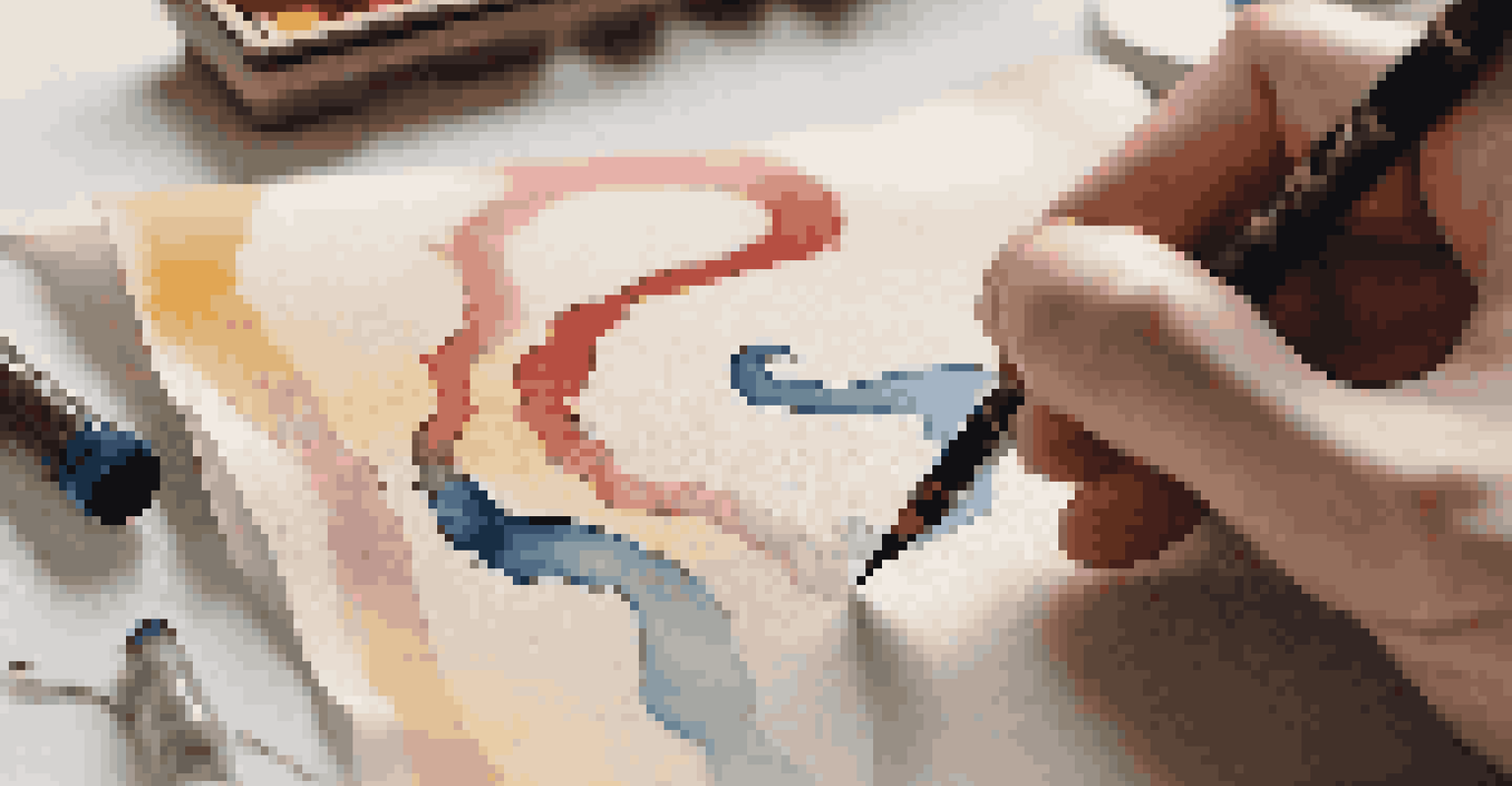
Lastly, don’t be afraid to get feedback from others. Sometimes, a different perspective can reveal insights you might have overlooked. Embrace the revision process as an opportunity to refine your work and create a stunning final product.