Using CSS for Creative Design: Beyond Basic Web Styling
Understanding the Power of CSS in Modern Web Design
Cascading Style Sheets, or CSS, is more than just a tool for styling your web pages; it's a powerful ally for creative expression. Think of CSS as the wardrobe of your website, allowing you to dress it up in various styles and make it stand out. With the right techniques, you can transform a basic layout into a stunning visual experience that captures attention and keeps visitors engaged.
Design is not just what it looks like and feels like. Design is how it works.
In today's digital landscape, where first impressions matter, utilizing CSS effectively can set your site apart from the competition. It allows designers to manipulate not just colors and fonts but also layout and interactivity, making websites more dynamic. By understanding its capabilities, you pave the way for innovative designs that resonate with users.
Ultimately, mastering CSS opens a world of creative possibilities. From animations to responsive designs, CSS is key to building websites that are not only functional but also visually appealing. By going beyond basic styling, you can create immersive experiences that draw visitors in and keep them coming back.
Exploring CSS Grid and Flexbox for Layout Mastery
When it comes to layout design, CSS Grid and Flexbox are two game-changing tools that can revolutionize your approach. CSS Grid allows you to create complex layouts in a two-dimensional space, while Flexbox excels in one-dimensional arrangements. Imagine building a puzzle: Grid helps you fit pieces into any shape, while Flexbox allows you to align pieces in a line, adjusting as needed.
Using these technologies together can help you achieve responsive designs that look great on any device. For instance, you might use Grid for the overall layout and Flexbox for aligning items within a grid cell, ensuring your content is well-structured and visually appealing. The combination of these two methods gives you flexibility and control over how your content is presented.
CSS Transforms User Experience
Incorporating CSS transitions and animations enhances interactivity, making sites feel more engaging and alive.
Ultimately, mastering Grid and Flexbox means saying goodbye to the constraints of traditional layout techniques. This mastery allows you to create websites that are not only visually stunning but also user-friendly, adapting seamlessly to different screen sizes and resolutions. As you explore these tools, your designs will become more intuitive and engaging.
Enhancing User Experience with CSS Transitions and Animations
Incorporating CSS transitions and animations can greatly enhance the user experience by adding a layer of interactivity to your web designs. These techniques allow you to create smooth changes in style, making your site feel more alive and engaging. For example, a button that changes color when hovered over provides immediate feedback, encouraging user interaction.
The details are not the details. They make the design.
Animations can also guide users’ attention to key content, such as a call-to-action button or an important message. By subtly animating these elements, you can direct users’ focus where it matters most, leading to higher engagement rates. Think of it as a dance; the right moves can draw the audience's eye without overwhelming them.
However, it’s essential to strike a balance—too much animation can distract rather than enhance. By using CSS transitions and animations thoughtfully, you can create a harmonious experience that feels natural and intuitive. As a result, your designs will not only look good but also offer a smooth and enjoyable user journey.
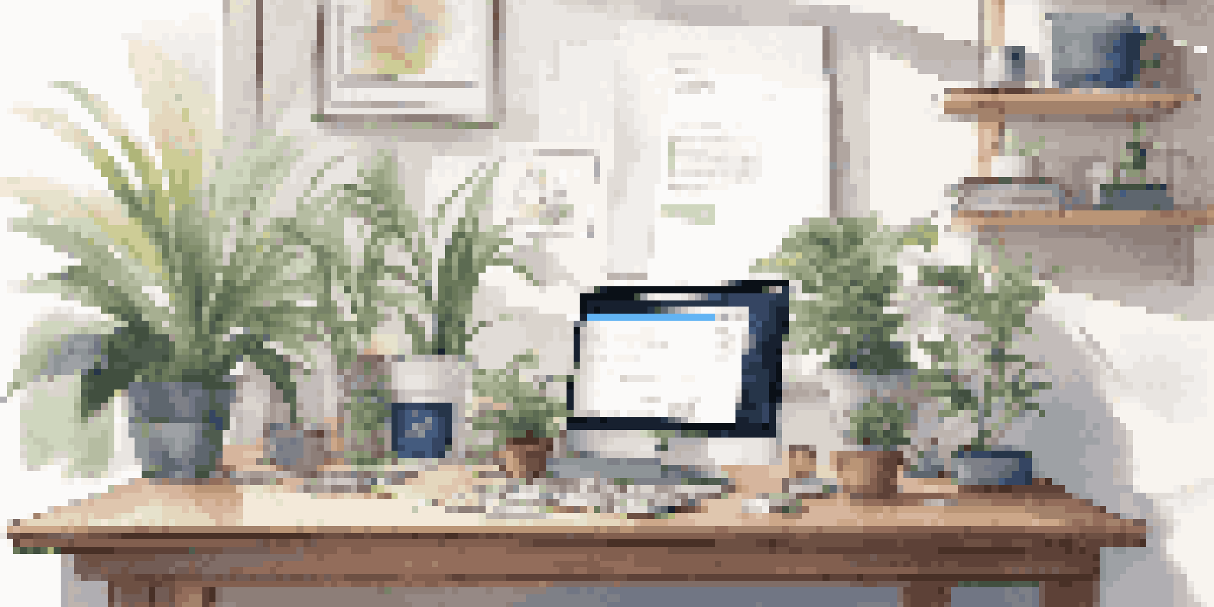
Responsive Design: Making Your Site Mobile-Friendly with CSS
In an era where mobile browsing is on the rise, responsive design is crucial. CSS provides a toolkit to ensure that your website looks great on devices of all sizes, from smartphones to large desktop monitors. Media queries, a powerful feature in CSS, allow you to apply different styles based on the device's characteristics, creating a tailored experience for every user.
Imagine a website that rearranges itself seamlessly as you resize the browser window. That’s the magic of responsive design! By using flexible grids, images, and media queries, you can create a layout that adapts fluidly, ensuring that content is always easily accessible. This adaptability not only enhances usability but also improves SEO, as search engines favor mobile-friendly sites.
Responsive Design is Essential
Utilizing CSS for responsive design ensures your website looks great on any device, improving user experience and SEO.
Ultimately, embracing responsive design is about putting your users first. When visitors can navigate your site effortlessly, regardless of their device, they're more likely to engage with your content. By implementing responsive CSS techniques, you create a positive experience that keeps users coming back for more.
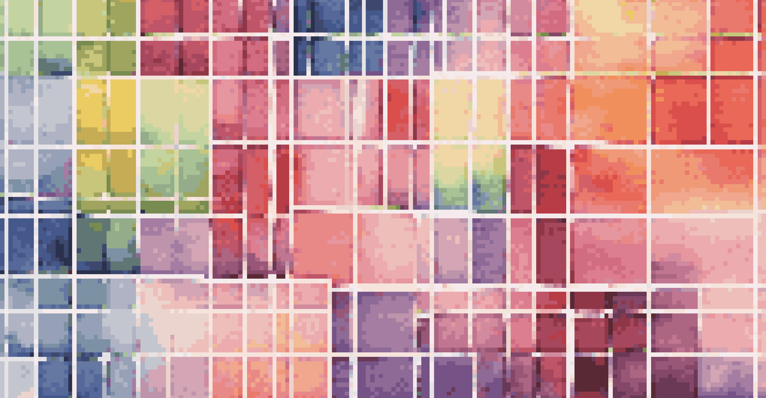
CSS Variables: Embracing Flexibility in Your Stylesheets
CSS variables, also known as custom properties, offer a level of flexibility that can streamline your design process. By defining a value once and reusing it throughout your stylesheet, you can make global changes with ease. Imagine having a single color palette for your website: change it in one place, and it updates everywhere—saving you time and reducing errors.
Using CSS variables can also enhance collaboration among teams. When working on larger projects, defining variables for colors, fonts, and spacing can create a consistent design language. This approach not only fosters a cohesive look but also allows for easier updates and adjustments as the design evolves.
By incorporating CSS variables into your workflow, you empower yourself to create more maintainable and scalable stylesheets. This flexibility can lead to more innovative designs, as you spend less time on repetitive tasks and more on creative exploration. Ultimately, CSS variables pave the way for a more efficient and enjoyable design process.
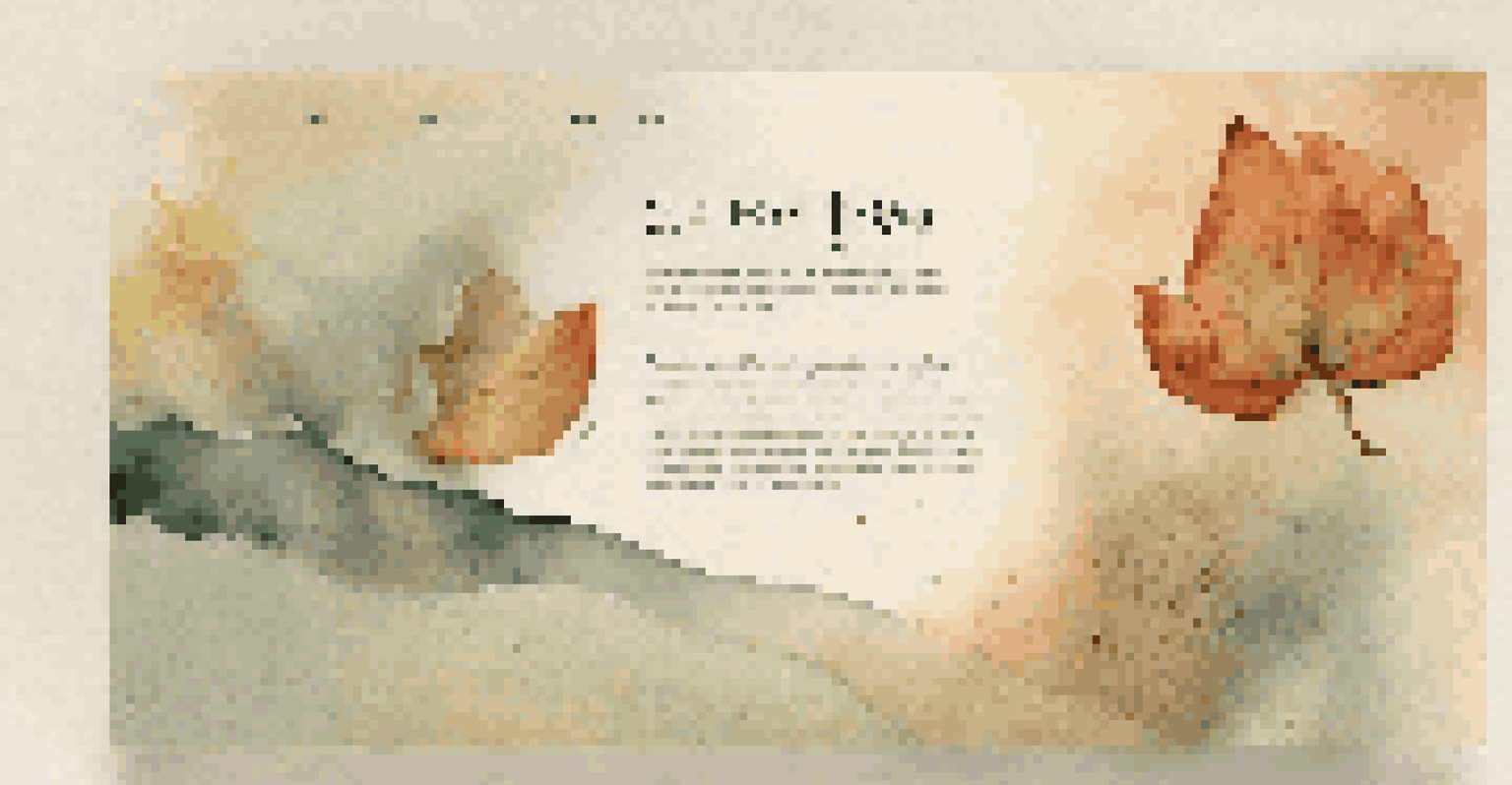
Creative Typography with CSS: Beyond Default Fonts
Typography is a key element in web design, and CSS allows you to take it to the next level. With Google Fonts and @font-face, you have access to a wide variety of typefaces that can enhance your site's personality. Imagine your website as a book; the right font can set the tone and mood, drawing readers in and making them feel at home.
Beyond just choosing fonts, CSS lets you manipulate text in creative ways. You can adjust line height, letter spacing, and even apply text shadows for added depth. This attention to detail can help create a more visually appealing experience and improve readability, ensuring that users can easily consume your content.
CSS Variables Streamline Design
CSS variables allow for flexible styling, enabling designers to make global changes easily and maintain consistent design language.
Ultimately, creative typography can elevate your web design from ordinary to extraordinary. By experimenting with different fonts and text styles, you can craft a unique identity for your brand. Remember, the right typography not only enhances aesthetics but also conveys the message and values of your website.
Utilizing CSS Frameworks for Rapid Development
CSS frameworks like Bootstrap or Foundation can significantly speed up your web development process. These frameworks come with pre-designed components and grid systems, allowing you to build responsive sites with minimal effort. Think of it as having a toolbox full of ready-to-use tools—no need to reinvent the wheel.
By leveraging these frameworks, you can focus more on the creative aspects of your design rather than getting bogged down by repetitive tasks. For example, instead of coding buttons from scratch, you can simply use a pre-built component and customize it to fit your brand. This not only saves time but also enhances consistency across your site.
However, while frameworks are incredibly useful, it’s important to customize them to fit your unique style. Relying too heavily on a framework can lead to cookie-cutter designs. By putting your personal touch on these tools, you can create a website that stands out while benefiting from the efficiency that CSS frameworks offer.