Creating Engaging Infographics with Digital Art Techniques
Understanding the Importance of Infographics
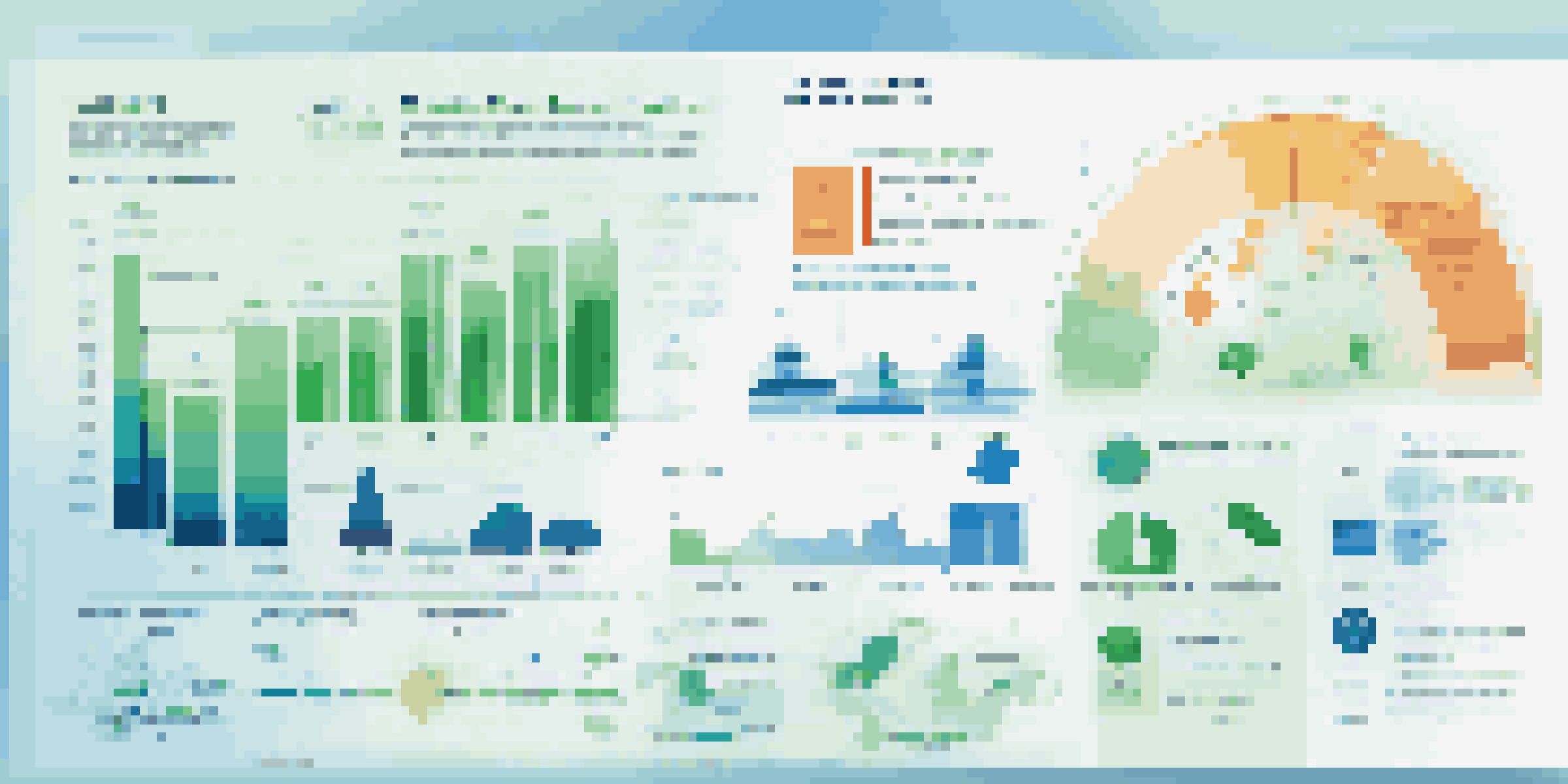
Infographics are a powerful tool for communication, merging visuals with information to convey complex data simply. They help in breaking down intricate topics into digestible bits, making it easier for the audience to grasp essential points. In a world inundated with information, engaging infographics can capture attention and enhance retention, ensuring your message resonates.
An infographic is worth a thousand words.
Consider how a well-designed infographic can summarize a lengthy report or an intricate process in just a few visuals. Instead of sifting through paragraphs of text, your audience can get the gist in a glance, making infographics an effective medium for sharing knowledge. This visual storytelling approach not only aids understanding but also encourages sharing and engagement across platforms.
Moreover, infographics are versatile; they can be used in presentations, on social media, or as part of educational materials. By incorporating digital art techniques, you can elevate the aesthetic appeal of your infographics, drawing in more viewers and leaving a lasting impression. Thus, understanding their importance is the first step towards creating impactful visuals.
Choosing the Right Digital Art Tools
When it comes to creating infographics, selecting the right digital art tools is crucial. There are numerous software options available, ranging from beginner-friendly tools like Canva to more advanced programs like Adobe Illustrator. Each tool offers unique features tailored to different skill levels and project needs, so take the time to explore which one resonates with your style.

For instance, Canva is perfect for those who want to create infographics quickly without extensive design knowledge. It provides templates and drag-and-drop functionality, making the design process seamless. On the other hand, Adobe Illustrator offers more in-depth capabilities for those looking to craft intricate designs, allowing for greater customization and creativity.
Infographics Enhance Communication
Infographics simplify complex data, making it easier for audiences to grasp essential points at a glance.
Ultimately, the choice of tools can significantly impact the quality of your infographic. A well-chosen program can enhance your workflow and result in a more polished final product. By equipping yourself with the right digital art tools, you set the foundation for creating engaging and visually appealing infographics.
Identifying Your Target Audience
Before diving into design, it's essential to identify your target audience. Understanding who will view your infographic shapes the content, style, and complexity of your visuals. Knowing whether your audience is made up of professionals, students, or casual readers can guide your approach and help you tailor your message effectively.
Design is the silent ambassador of your brand.
For example, if your audience consists of industry experts, you might use more technical language and complex data representations. Conversely, for a general audience, simpler language and straightforward visuals will likely be more engaging. This alignment between design and audience needs makes your infographic more relatable and impactful.
Additionally, considering your audience's preferences can inspire creative design choices. Are they drawn to vibrant colors, or do they prefer a minimalist aesthetic? By incorporating these insights into your infographic, you enhance the likelihood of capturing their attention and ensuring that your message is conveyed clearly.
Crafting a Compelling Narrative
Every great infographic tells a story. Crafting a compelling narrative involves structuring your information logically and ensuring that it flows smoothly from one point to the next. This narrative thread not only guides the viewer through the data but also emphasizes the significance of the information presented.
Think of your infographic as a journey for the viewer; each section should build on the last, leading to a satisfying conclusion. For instance, start with an engaging introduction that poses a question or presents a problem, then gradually unveil the data and insights that offer solutions or answers. This approach keeps viewers engaged while making the content memorable.
Know Your Audience for Impact
Identifying your target audience shapes the content and design of your infographic, ensuring it resonates effectively.
Moreover, integrating visuals that complement your narrative can enhance understanding and retention. Charts, graphs, and icons can serve as visual cues that support your story, helping to reinforce key messages. By weaving a narrative into your infographic, you create a richer experience that resonates with your audience.
Design Principles for Effective Infographics
Applying design principles is crucial for creating effective infographics. Key elements such as balance, contrast, and alignment contribute to readability and visual appeal. For instance, ensure that text and visuals are balanced throughout the layout, preventing any section from feeling overcrowded or cluttered.
Contrast is another vital principle; using contrasting colors can draw attention to essential data points or sections. This not only enhances visibility but also guides the viewer's eye through your infographic. Additionally, maintaining proper alignment of elements fosters a clean, professional look that boosts credibility.
Finally, don't forget about white space! This often-overlooked element allows your design to breathe and makes the content more digestible. By adhering to these design principles, your infographic will not only look great but also effectively communicate your message.
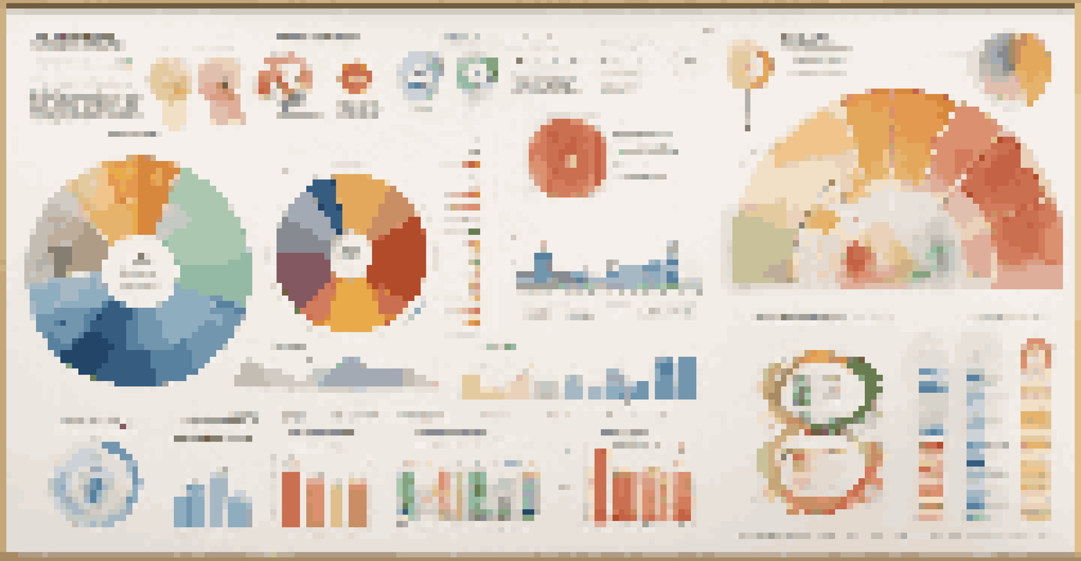
Incorporating Visual Elements and Colors
Visual elements such as icons, charts, and images can significantly enhance the effectiveness of your infographic. They serve as visual shorthand, enabling viewers to grasp complex concepts quickly. For example, a pie chart can instantly convey the distribution of data, while an icon can symbolize a key idea, making the information more relatable.
When choosing colors, consider the emotions and associations they evoke. For instance, blue often represents trust and professionalism, while vibrant colors can convey energy and excitement. A well-chosen color palette not only enhances visual appeal but also reinforces the message of your infographic, helping to create a cohesive look.
Effective Design Principles Matter
Applying design principles like balance, contrast, and alignment is crucial for creating visually appealing and readable infographics.
It's also essential to maintain consistency in your visual elements. Using a uniform style for icons and illustrations contributes to a polished appearance. By thoughtfully incorporating visual elements and colors, you can create an infographic that is not only attractive but also impactful.
Sharing and Promoting Your Infographics
Once you've created your engaging infographic, the next step is sharing and promoting it effectively. Consider the platforms where your target audience is most active, whether it's social media, blogs, or industry websites. Tailoring your promotion strategy to these platforms can enhance visibility and engagement.
For instance, sharing your infographic on Instagram or Pinterest, where visuals reign supreme, can attract a more extensive audience. Similarly, embedding your infographic in a relevant blog post can provide context and drive traffic to your website. Don't forget to use hashtags and keywords to optimize your content for search engines.
Additionally, encourage sharing by including social media buttons or asking your audience to share their thoughts. Engaging with viewers through comments or discussions can foster a sense of community and encourage further dissemination of your infographic. By focusing on effective sharing strategies, you maximize the reach and impact of your hard work.