The Importance of Color Theory in Jewelry Design
What is Color Theory and Why Does It Matter?
Color theory is the study of how colors interact and influence one another. It helps designers understand how to combine colors effectively to create appealing aesthetics. In jewelry design, color theory plays a crucial role in evoking emotions and attracting potential buyers.
Color is the keyboard, the eyes are the harmonies, the soul is the piano with many strings.
When designers grasp the principles of color theory, they can make informed choices about materials and finishes. This knowledge allows them to create pieces that resonate with their target audience. For example, warm colors like red and orange can evoke feelings of passion, while cooler tones like blue and green may impart calmness.
Ultimately, understanding color theory means designers can craft jewelry that not only looks beautiful but also tells a story or conveys a particular mood. This emotional connection is what often drives a customer to make a purchase.
The Color Wheel: A Designer’s Best Friend
The color wheel is an essential tool in color theory, showcasing the relationships between colors. It consists of primary, secondary, and tertiary colors, providing a visual guide for designers. By understanding this wheel, jewelry designers can create harmonious and visually appealing pieces.
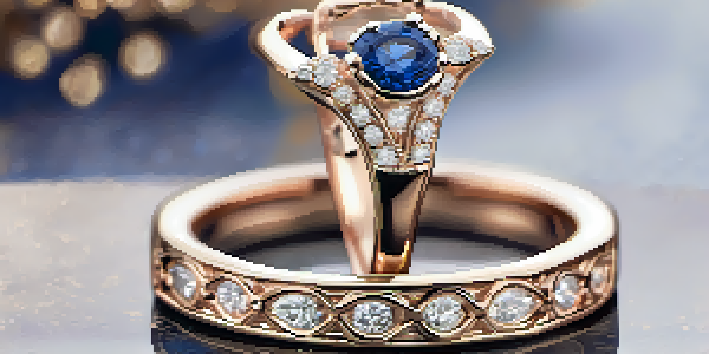
For instance, complementary colors—those opposite each other on the wheel—can create striking contrasts that catch the eye. A piece featuring a vibrant blue stone paired with a warm orange accent can create a stunning visual effect. This contrast can make a piece stand out, drawing attention and sparking interest.
Understanding Color Theory Matters
Grasping color theory helps jewelry designers evoke emotions and create appealing aesthetics that resonate with potential buyers.
Moreover, using analogous colors—those next to each other on the wheel—can produce a more subtle and elegant look. This technique often results in a soothing palette, perfect for delicate or understated jewelry pieces, allowing the wearer’s personal style to shine through.
Emotional Impact of Colors in Jewelry Design
Colors have the power to evoke emotions and memories, making them pivotal in jewelry design. For example, the color blue is often associated with serenity and trust, making it a popular choice for pieces intended for special occasions. When customers wear jewelry in colors that resonate with them, it can enhance their mood and boost their confidence.
Colors are the smiles of nature.
Conversely, colors like red can symbolize love and passion, making them ideal for romantic gifts. This emotional connection not only influences the buyer's decision but also helps to foster a deeper attachment to the piece. Jewelry becomes more than just an accessory; it transforms into a meaningful keepsake.
Designers can leverage this emotional impact by thoughtfully choosing colors that align with the message they want to convey. By doing so, they create pieces that resonate with customers on a personal level, enhancing the overall appeal of their designs.
The Role of Trends in Color Selection
Color trends in jewelry design can shift from season to season, influenced by fashion, culture, and even technology. Staying updated with these trends is crucial for designers who want their pieces to remain relevant. For instance, Pantone's Color of the Year significantly impacts color choices in jewelry collections, guiding designers toward popular palettes.
Incorporating trendy colors can attract customers looking for the latest styles. However, it's essential to balance trendiness with timelessness, ensuring that pieces can remain cherished for years to come. For example, while a vibrant color may be popular now, a classic shade like gold or silver can provide lasting appeal.
Colors Influence Emotional Connections
The emotional impact of colors in jewelry design fosters a deeper attachment between the piece and the wearer, enhancing its value.
By blending trendy colors with classic designs, jewelry designers can create collections that resonate with a broad audience. This approach not only caters to current tastes but also establishes a sense of lasting value for consumers.
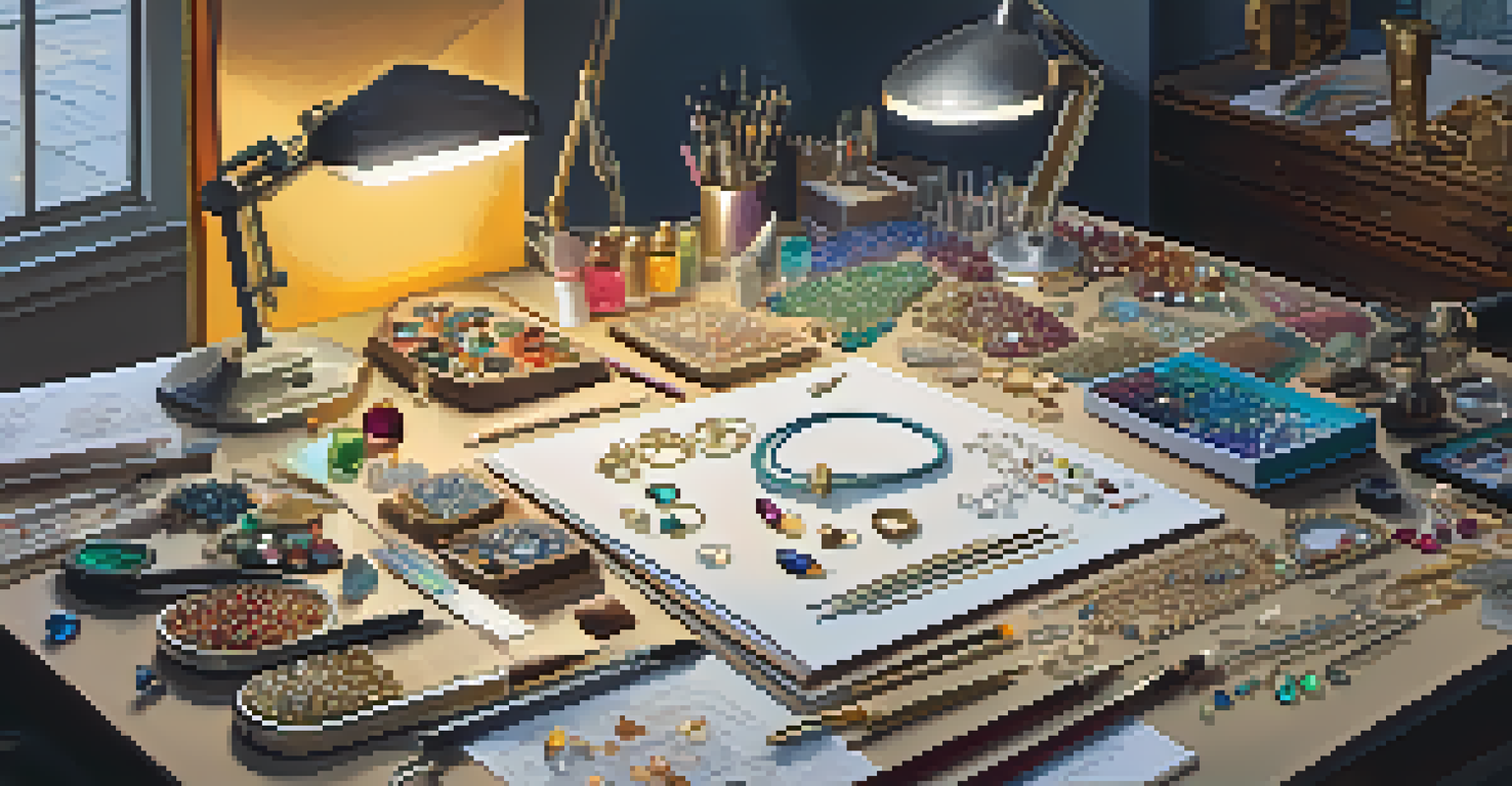
Combining Materials and Colors for Unique Designs
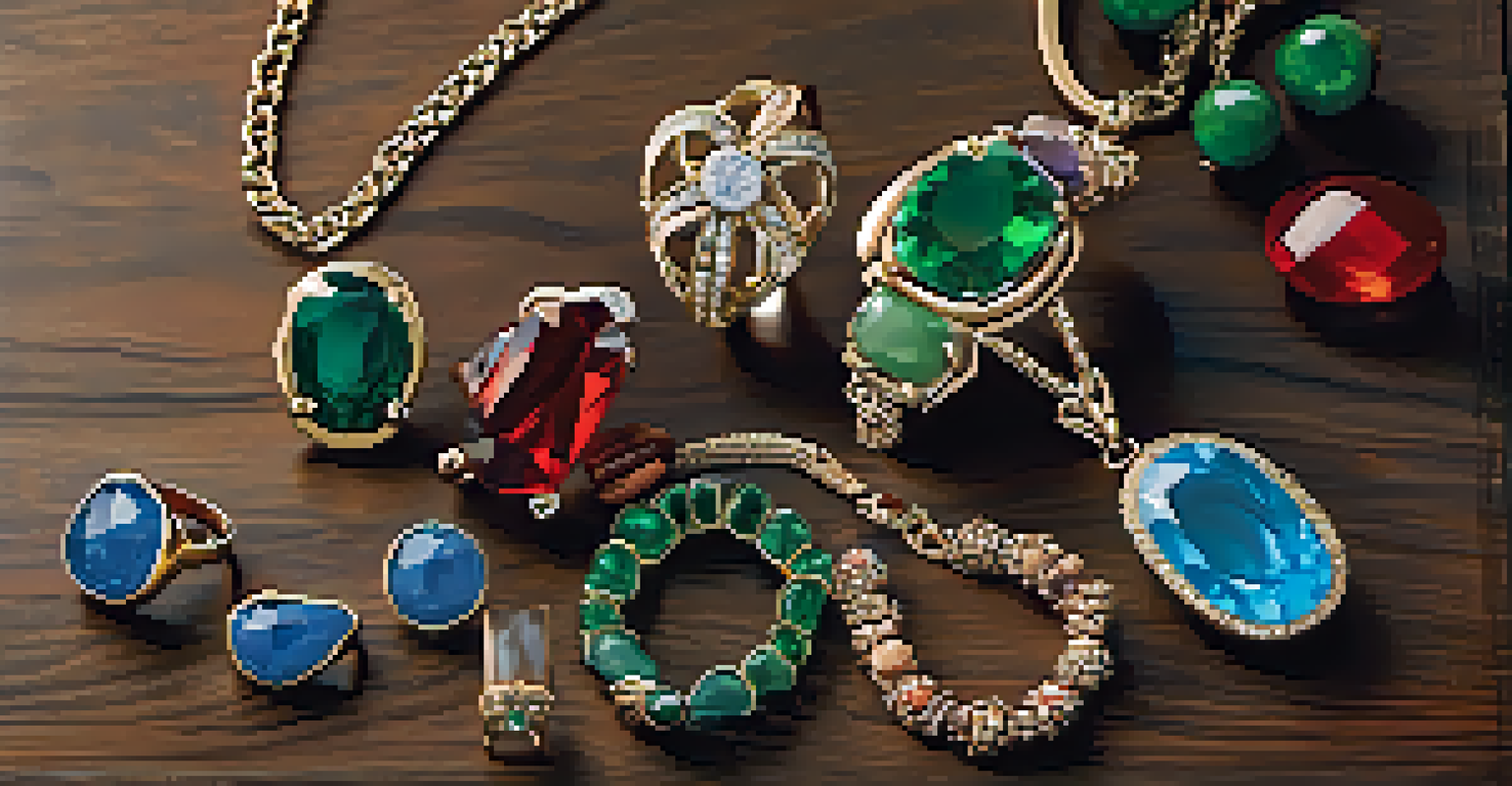
The choice of materials in jewelry design plays a crucial role in color perception. Different materials reflect and absorb light differently, which can alter how colors are seen. For instance, a gemstone’s clarity and cut can enhance its color, making it look more vibrant and appealing.
Designers often experiment with various combinations of materials to create unique color effects. For example, pairing a deep blue sapphire with sparkling diamonds can enhance the richness of the blue while adding a touch of elegance. This strategy not only showcases the beauty of each material but also creates a cohesive design.
Moreover, incorporating mixed metals can introduce a range of colors into a single piece. For example, a rose gold setting with white gold accents can produce a stunning contrast that draws the eye. Such innovative combinations can set a designer apart and attract customers seeking something truly special.
Cultural Significance of Colors in Jewelry
Colors hold different meanings across various cultures, making it essential for designers to consider these implications. For example, in many Eastern cultures, red symbolizes good luck and prosperity, often making it a popular choice for wedding jewelry. Understanding these cultural nuances can help designers create pieces that resonate with diverse audiences.
Incorporating culturally significant colors can also add depth to a jewelry collection. For instance, using green to represent growth and renewal can appeal to customers seeking meaningful gifts for milestones like graduations or new beginnings. This thoughtful approach to color selection can foster a deeper connection between the jewelry and the wearer.
Trends and Culture Shape Color Choices
Staying updated on color trends and understanding cultural significance allows designers to create relevant and meaningful jewelry pieces.
By being mindful of cultural significance, designers can create pieces that not only look beautiful but also carry a rich narrative. This adds an extra layer of value that customers often appreciate, enhancing their overall experience.
Final Thoughts: The Power of Color in Jewelry Design
In conclusion, color theory is a vital aspect of jewelry design that significantly influences both aesthetics and emotional appeal. By understanding color relationships, designers can create stunning pieces that resonate with customers. This knowledge not only enhances the beauty of the jewelry but also deepens the emotional connection between the piece and its wearer.
As trends evolve and cultural contexts shift, staying attuned to color dynamics will be essential for designers aiming to stay relevant. Whether by experimenting with new materials or exploring cultural meanings, the possibilities are endless. The right use of color can elevate a simple design into a statement piece that captures attention.
Ultimately, the power of color in jewelry design goes beyond mere decoration; it is about creating a personal experience. By tapping into the emotional resonance of color, designers can craft pieces that not only adorn but also tell a unique story, making each piece special to the wearer.